


September 18, 2025

September 10, 2025
July 3, 2025
January 10, 2025
Commodity Charts: A Comprehensive Guide to Technical Analysis for Trading in the Indian Stock Market
Author
Shoonya Team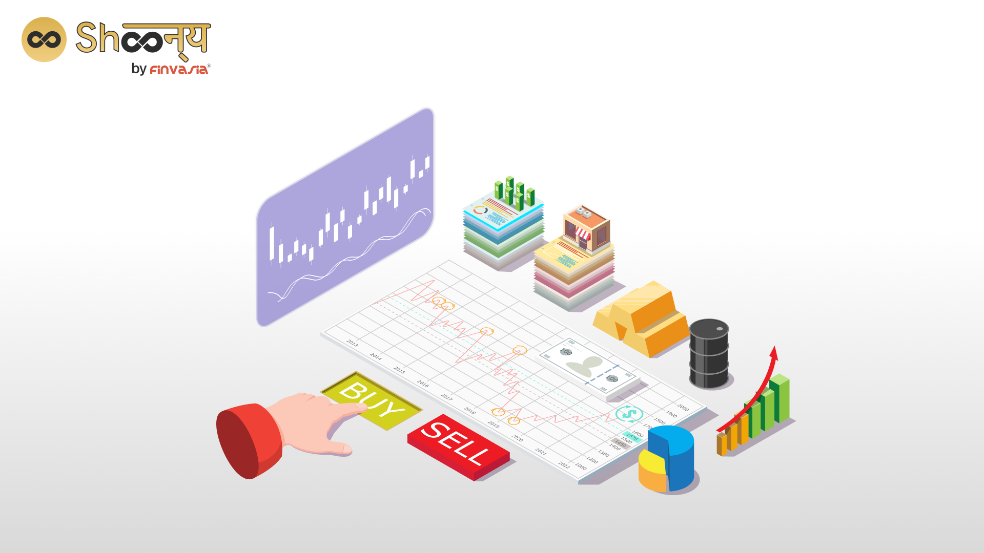
Commodity charts are visual representations of the price movements of various commodities such as gold, silver, crude oil, and more, over a specified period. They are a trader’s window into the market’s past performance, offering invaluable insights for future predictions. Commodity charts can include other types of data, such as volume, open interest, and indicators, which can provide additional information for technical analysis. Let’s break down the key elements of commodity charts:
Let’s now dissect the key components that constitute a commodity chart:
Price Axis
Situated along the vertical side of the chart, the price axis is responsible for representing the commodity’s price levels. To illustrate this, consider tracking the price of gold. In this case, the price axis will exhibit the value of gold per unit, which may be measured in terms of ounces or grams, depending on your preference and the prevailing market conventions.
Time Axis
Positioned horizontally, the time axis serves as a crucial element of the chart. It functions to delineate the specific time frame over which you are analyzing the commodity’s price movements. This timeframe can encompass a vast range, spanning from mere minutes to extensive periods of years. Your choice of time frame is contingent on your unique trading strategy and objectives, as different time frames may reveal distinct patterns and trends within the market.
Candlestick Patterns
Candlestick charts are popular in technical analysis. Each candlestick represents a specific time period and displays the commodity’s opening, closing, high, and low prices within that period. Different candlestick patterns convey various market sentiments, such as bullish or bearish trends.
Why Technical Analysis in Trading Matters
Technical analysis involves using historical price data, like the information displayed on commodity charts, to forecast future price movements. This analysis is based on the belief that historical price patterns tend to repeat themselves, and thus, by understanding these patterns, traders can make better-informed decisions.
Let’s dive into a few practical examples:
Example 1: Identifying Support and Resistance Levels
Suppose you’re interested in trading gold in the Indian market. By examining the historical price data on a gold commodity chart, you notice that the price consistently struggles to drop below a certain level (let’s say ₹45,000 per 10 grams). This level acts as a “support” because the price tends to bounce back when it approaches it. Conversely, there might be another price level (say ₹50,000 per 10 grams) where the price tends to stall or reverse. This level is known as “resistance.” Recognizing these levels can help you make strategic entry and exit decisions.
Example 2: Spotting Trend Reversals
Commodity charts are also handy for identifying potential trend reversals. Suppose you’re trading crude oil, and you notice a pattern where the price consistently rises for several weeks, forming higher highs and higher lows (an uptrend). However, suddenly, the price starts forming lower highs and lower lows. This could indicate a trend reversal from bullish to bearish, signaling a potential selling opportunity.
Using Technical Analysis Tools
To perform technical analysis effectively, traders often utilise various tools and indicators. Some of these include moving averages, Relative Strength Index (RSI), MACD- Moving Average Convergence Divergence, and Bollinger Bands, among others. These tools provide additional insights into market trends, momentum, and potential reversals.
Conclusion
Mastering commodity charts and technical analysis is a journey that requires practice and continuous learning. By understanding the language of commodity charts and utilizing technical analysis tools, you can significantly enhance your trading skills and make more informed decisions in the Indian stock market.
Remember, while technical analysis can provide valuable insights, it should be combined with thorough research, risk management, and a well-defined trading strategy. With dedication and knowledge, you’ll be well on your way to becoming a successful trader in the Indian stock market, confidently navigating the waves of commodity charts and market trends. Happy trading!
FAQs| Commodity Charts
To read a commodity chart, focus on the price and time axes. The vertical axis shows the commodity’s price, while the horizontal axis displays the time period. Candlestick patterns and indicators help identify trends and potential reversals.
A commodity chart is a graphical representation of a commodity’s historical price movements over a defined time frame. It visually displays price data, allowing traders and investors to analyze trends, patterns, and potential trading opportunities.
Commodities data can be obtained from various sources. Consider checking commodity exchanges, financial news websites, brokerage platforms, or dedicated data providers for reliable and up-to-date information.
______________________________________________________________________________________
Disclaimer: Investments in the securities market are subject to market risks; read all the related documents carefully before investing.

Explore Our Offerings

Stocks
Trade equities across NSE and BSE with zero delivery charges. Invest, hold or sell with a seamless experience.


Future & Options
Execute complex strategies with simple tools and real-time data.

IPOs
Apply to the latest IPOs in just a few taps. Stay updated and capture opportunities as they open.